
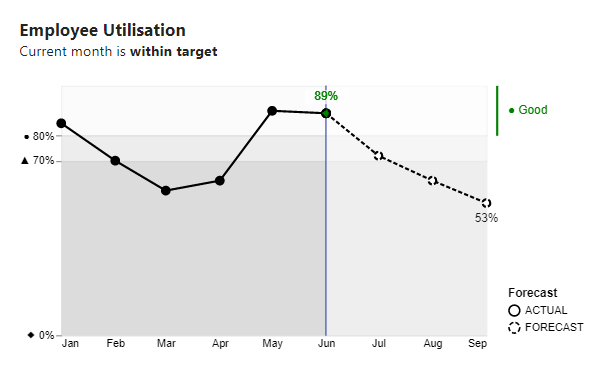
I’ve come across many charts like this in the wild. This one depicts utilisation and RAG status by month. They’re not bad charts, they serve a purpose, but they could…
Category: Custom Visualisations
Legend for a layered plot in Deneb
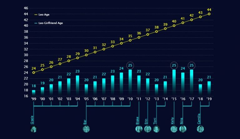
I came across this dataviz in my Twitter feed and it instantly drew my attention: My interest was in the aesthetics of the visual and not the subject matter. I…
Images and custom shapes in Deneb
Over the past few months, I’ve had considerable fun exploring images and custom shapes with Deneb Custom visual for Power BI. I’ve finally gotten around to blogging about it. There…
Raincloud Plots with Deneb
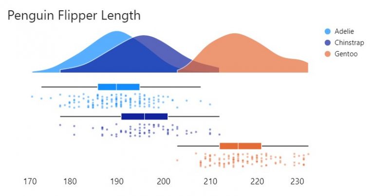
Raincloud plots are a relatively recent and effective addition to the data visualisation toolkit comprising three parts: 1) distributions as density (half-violin plot); 2) summary statistics (box plot) and 3)…
Line interpolation
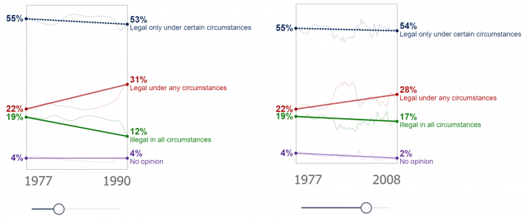
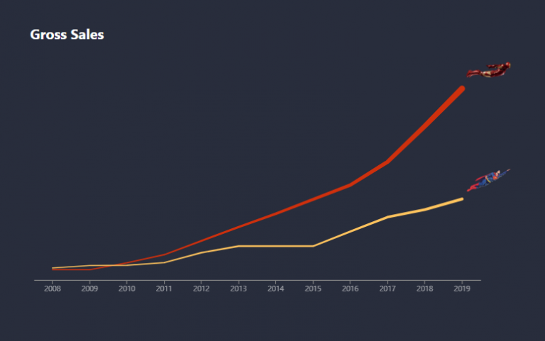
Makeover Monday again! and this time I’m creating a slope graph. Yes, I could achieve this with the core visualisation, but I wouldn’t have as much control as I desired…
Faceted Charts with Deneb
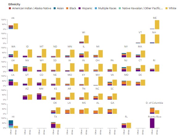
Another creation from a Makeover Monday challenge using Deneb custom visual for Power BI. The original visualisation by Visual Capitalist can be found here. I thought I’d make a slight…
Microcharts and radial gauges
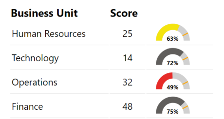
I’d written in a previous post about building a custom gauge table with HTML. This is an extension of that post with DAX for additional gauges or microcharts. Radial Gauge…
Conditional KPI Cards with Deneb
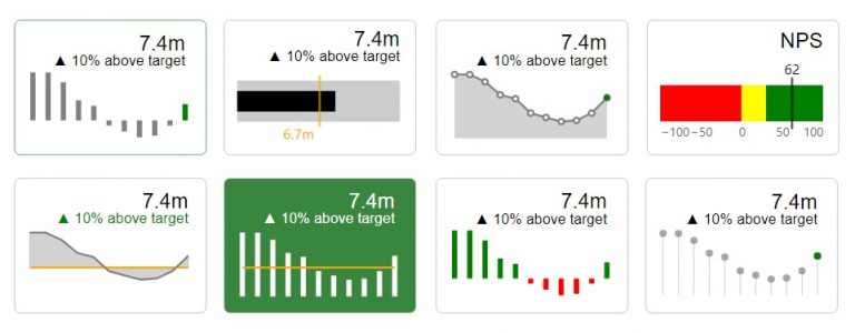
I’d written a piece recently on exploring the Deneb custom visual for Power BI. In that post I touched on KPI Style visuals. I hadn’t seen much in the way…
Heatmap with marginal bars
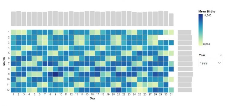
Another visual I explored through a Makeover Monday challenge. To create the chart I installed the latest version of Deneb, dragged the measures I needed into the fields pane. In…
Area between two lines
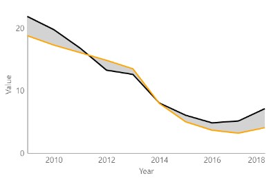
A graph I explored through a Makeover Monday challenge. It didn’t make the final design but I thought I’d write it up for another time. Area fill is sometimes used…