
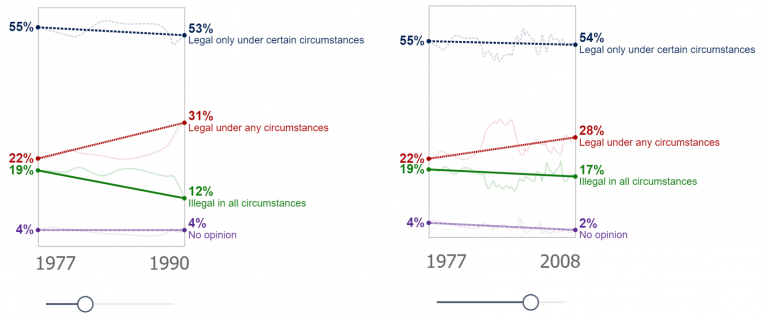
Makeover Monday again! and this time I’m creating a slope graph. Yes, I could achieve this with the core visualisation, but I wouldn’t have as much control as I desired…
Category: DataViz
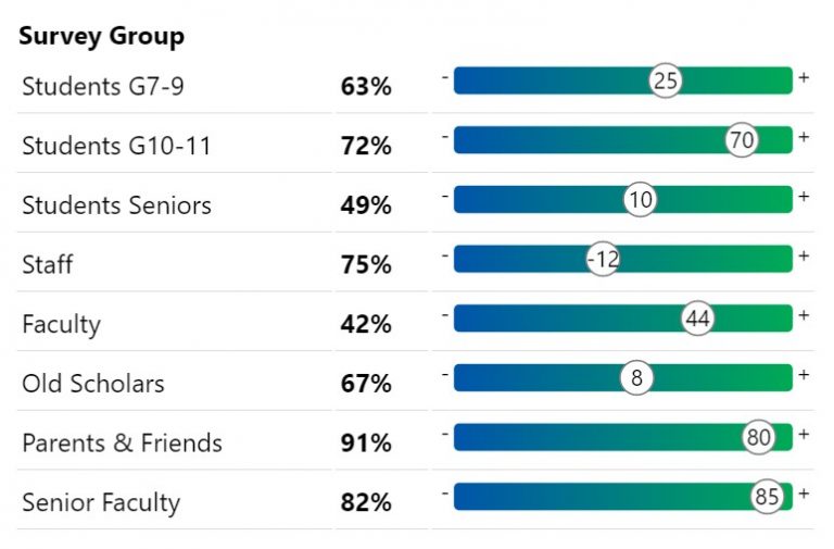
Microcharts and radial gauges
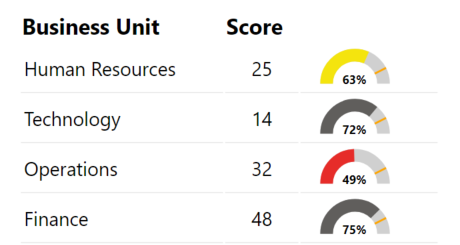
I’d written in a previous post about building a custom gauge table with HTML. This is an extension of that post with DAX for additional gauges or microcharts. Radial Gauge…
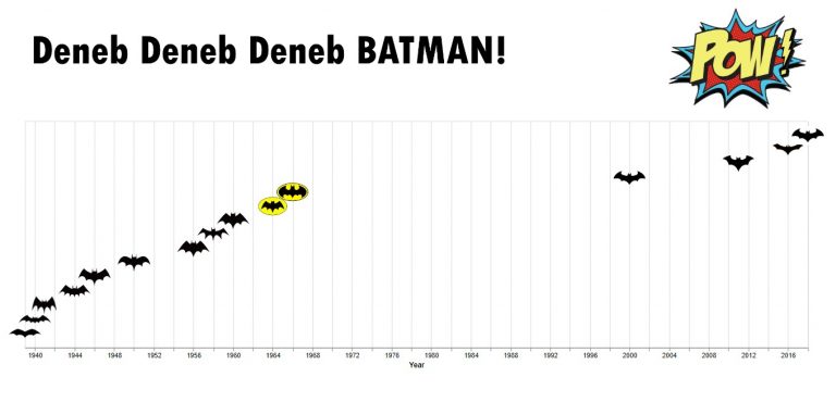
Conditional KPI Cards with Deneb
I’d written a piece recently on exploring the Deneb custom visual for Power BI. In that post I touched on KPI Style visuals. I hadn’t seen much in the way…
Heatmap with marginal bars
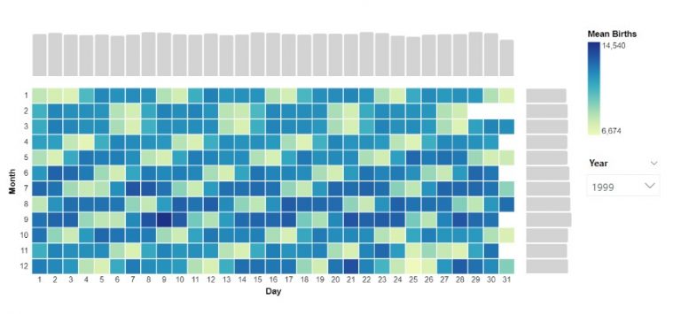
Another visual I explored through a Makeover Monday challenge. To create the chart I installed the latest version of Deneb, dragged the measures I needed into the fields pane. In…
Area between two lines
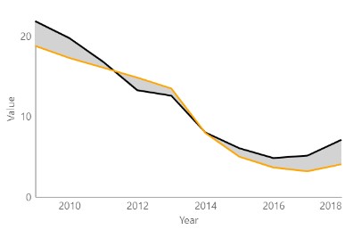
A graph I explored through a Makeover Monday challenge. It didn’t make the final design but I thought I’d write it up for another time. Area fill is sometimes used…
Exploring Deneb for Power BI
In my short career doing data visualization with Power BI, I have always desired the flexibility to do more with my visuals. So when I came across a demo for…
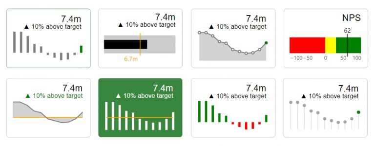
Building a custom Gauge Table with HTML
A quick design for a very specific use case I wanted to visualise scores similar to the above in a way that was quick and easy for me to read…
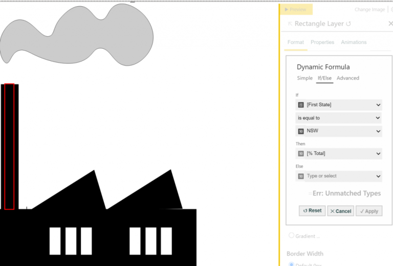
Reasons to avoid gradient backgrounds on Power BI reports

Gradient backgrounds are all the rage in dashboard design. They appear to be floating around everywhere. Looks cool right? Perhaps. I am not a fan, and for some time have…
Taking PureViz for a spin
I came across PureViz in my LinkedIn feed a week or two ago. It immediately caught my attention because lo and behold, there was a rotating turbine 🙂 “Ooh is…
Exploring Data-Driven SVG Part 4 Animation and Filters

After exploring SVG size, colour fill, pattern fill, rotation, polygon paths and arcs, the next natural progression was to explore filters and animation. There are a few methods to animating…