
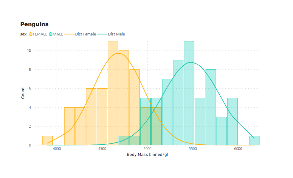
Overlapping histograms with normal curve overlays are used to compare the distribution of a numerical variable across different groups such as male and female body mass. With this we can glance the central tendency, spread, and skewness of the data within each group and also how well the data follows a normal distribution. The further apart the modes of distribution, the more significant the differences between groups.
To create an overlapping histogram we need to:
- Create Summary Stats:
Calculate mean, standard deviation, and count for the data.
AVERAGE BODY MASS = AVERAGE('penguins_size'[body_mass_g])

STD_DEV = STDEV.S('penguins_size'[body_mass_g])

COUNT = COUNTROWS('penguins_size')
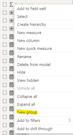
2. Create Bins:
- Select ‘penguins_size'[body_mass_g] field and create new group.
- Create bins by choosing the number of bins suitable for the data.
- A new field will be created ‘penguins_size'[body_mass_g (bins)], grouping data into bins. This will form the X-Axis.
Choosing the right number of bins for your data isn’t always straightforward and is often done by sight. When cross-filtering histograms, bins may need to be adjusted. Radacad has a solution for dynamically adjusting number of bins (link provided below).
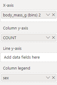
3. Configure Combo Chart:
- Add combo bar and line chart to the canvas
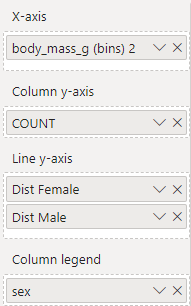
- Place ‘penguins_size'[body_mass_g (bins)] on the X-Axis.
- Place the count of penguins measure on the column Y-Axis.
- Group by sex by placing the sex field into the legend field well.
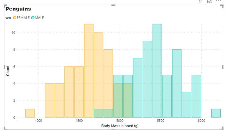
4. Format Bars:
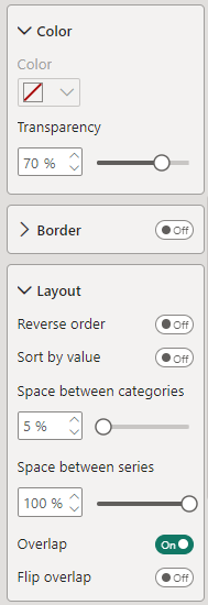
- Format bars with a solid outline and 70% transparent fill.
- Set the bars to overlap 100%.
- Adjust the gap between bars. A histogram typically does not have gaps between bars.
5. Create Normal Distribution Measures:
- Create a measure for finding the normal distribution curve for a series
Dist Female =
var avg_val = CALCULATE([AVERAGE BODY MASS], ALLSELECTED('penguins_size'), 'penguins_size'[sex]="FEMALE")
var std_dev = CALCULATE([STD_DEV], ALLSELECTED('penguins_size'), 'penguins_size'[sex]="FEMALE")
var x_dist = SELECTEDVALUE ('penguins_size'[body_mass_g (bins)])
var cumulative = FALSE()
var result = NORM.DIST(x_dist,avg_val,std_dev,cumulative)

RETURN
result
Scale the distribution curve to the histogram by multiplying the result by the bin count and number of data points
Dist Female =
var avg_val = CALCULATE([AVERAGE BODY MASS], ALLSELECTED('penguins_size'), 'penguins_size'[sex]="FEMALE")
var std_dev = CALCULATE([STD_DEV], ALLSELECTED('penguins_size'), 'penguins_size'[sex]="FEMALE")
var x_dist = SELECTEDVALUE ('penguins_size'[body_mass_g (bins)])
var cumulative = FALSE()
var result = NORM.DIST(x_dist,avg_val,std_dev,cumulative)
var bin_count = 20 // What if parameter if dynamic
var sample_size = CALCULATE(COUNTROWS('penguins_size'), ALL('penguins_size'))
var dist_scale = bin_count*sample_size

RETURN
result*dist_scale
Repeat for the second series and add both measures to the line Y-Axis of the combo chart
4. Format Lines:
- Set the colours of the lines
- Set the interpolation to smooth and adjust the monotone or cardinal smoothing.
Footnote:
Dynamic bands:
That is good – I’m saving this