*WARNING* This article contains images that may be potential vestibular and photosensitivity risk.
Drop shadows should be used with caution in UI/UX design.
When overused or poorly implemented, drop shadows can make the interface look busy and overwhelming, leading to a decreased user experience. They can also interfere with readability, especially when applied to text elements, as the shadows may make the text appear blurry or difficult to read, particularly on lower-resolution screens or smaller devices.
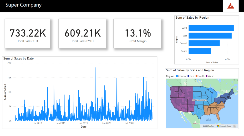
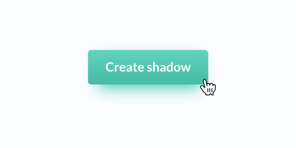
Drop shadows can have negative effects on accessibility. People with visual impairments may have difficulty perceiving or distinguishing elements with drop shadows. Additionally, drop shadows can create confusion when it comes to interactive elements such as buttons or links. Users might struggle to differentiate between a button and its surrounding shadows. In the pursuit of a clean and minimalistic design, it is important to prioritise clarity and simplicity, avoiding unnecessary visual effects like drop shadows that can cause frustration, introduce ambiguity and hinder accessibility.
Drop shadows in UI/UX design can have a significant impact on individuals with vestibular conditions. Vestibular disorders affect the inner ear and can cause dizziness, vertigo, and other balance-related issues. The use of drop shadows, particularly when animated or applied to moving elements, can exacerbate these symptoms and create a disorienting experience for users. The shadows may create an illusion of depth or movement that can trigger dizziness or visual disturbances, making it difficult for individuals to navigate and interact with the interface comfortably. To prevent discomfort for users with vestibular conditions, it is crucial to design interfaces with reduced visual complexity and avoid excessive use of drop shadows or unnecessary animation effects.
I, myself, suffer from visually induced dizziness. I have damage to my left ear and also take medications which have symptoms of vertigo.
Drop-shadows used in software applications can impact my ability to perform my job at work.
Similar to Facundo Corradini’s experience, I have been greatly impacted by viewing UI elements with drop-shadows and animations along with data visuals such as 3D pie charts and overlapping bar charts. The most severe case caused me to stop work mid-afternoon, roll into bed, in which I stayed until the morning – still shaky when I woke up.
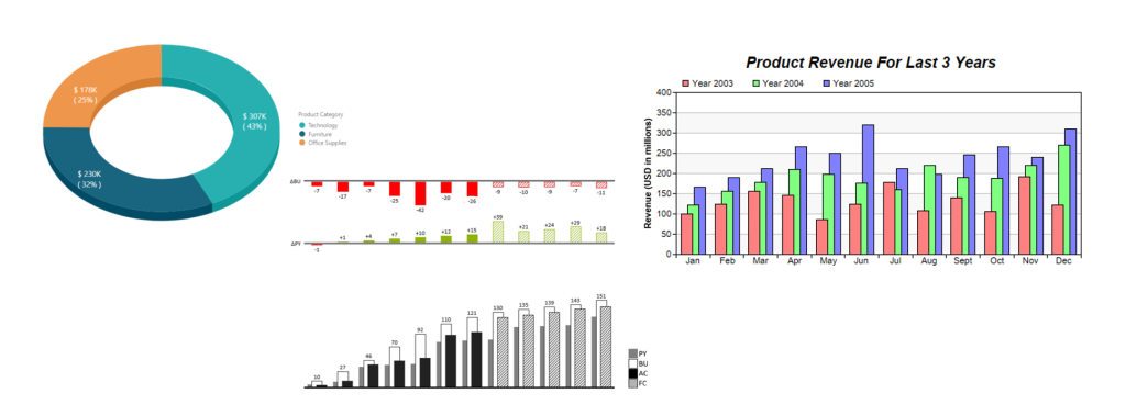
Many Report Developers are keen to use shadows on visual elements to create a sense of “depth” or “visual interest” to their reports. There are other ways to achieve this, of course, but if inclined to use shadows I recommend using a centered outer shadow or outer glow.
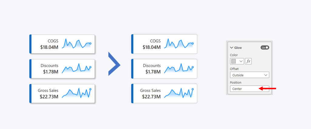
I personally find this less triggering. HOWEVER, as I discovered last weekend through applying this in my own work, extended exposure can still cause dizziness, especially when scrolling up and down through a social media stream.

Sometimes I learn things the hard way….

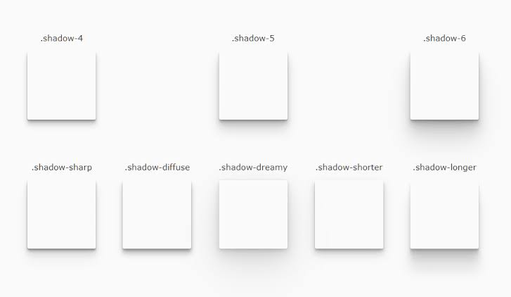
Thank you very much for this article. I am no fan of shadows and usually I feel like the only one as some of my colleagues cricticise my work as plain or too flat (they use too many effects). I find those simple and easy-to-read dashboards comforting.
Same!
I have very bad taste in design, and I spent hours watching tutorials on how to create perfect shadows, thinking shadows are a must-have. Now I will go with outside/center option. Thank you 🙂