Aside from the pie and donut charts, there is not much in the way of polar plots in the Power BI core visual set.
Polar plots are rarely used in business context. We might use radars in skills assessments, but others have a very specific use case or are used as a break from the mundane.
To hack a polar plot, on a cartesian chart, we need to calculate the polar positions of our datapoints, and transform them into cartesian coordinates.
A limitation we will reach, at the time of writing, is that lines between these points on a Power BI core visual will only plot left to right.
If we were to create a circular shape, we might create separate measures for positive and negative values.
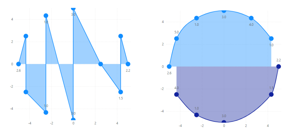
And add logic to those measures to plot the first and last points
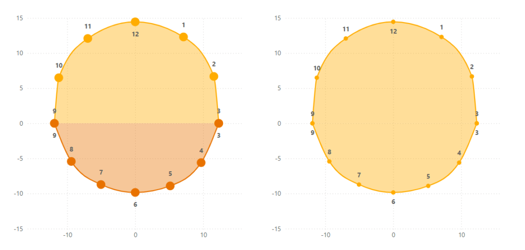
Another limitation is that of guidelines. To create circular guidelines, we would need to deselect the linear gridlines from the visual formatting options, and instead utilise a custom background image, with circular guidelines, that fill the area of the plot neatly. This would also require setting the axes min and max values be have equal positive and negative magnitude.
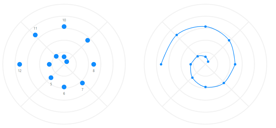
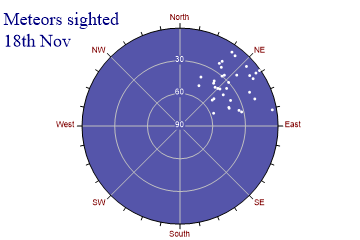
Polar Scatter Plot
Creating a polar scatter is fairly simple.
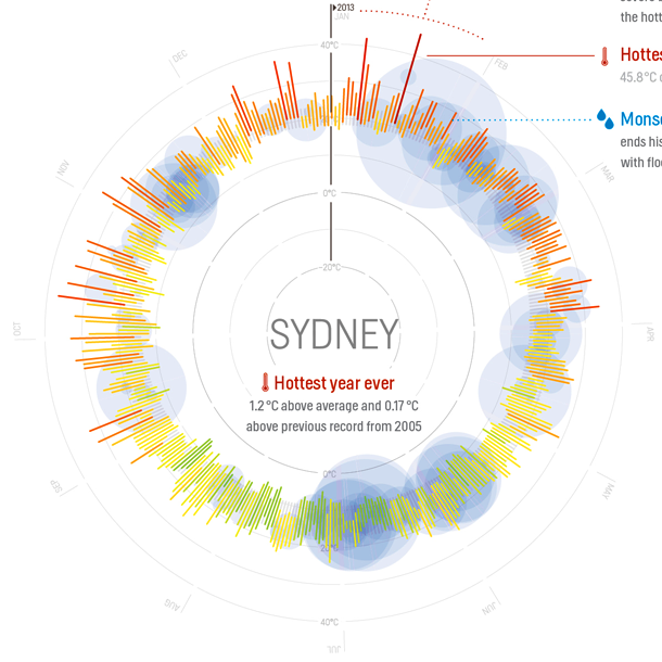
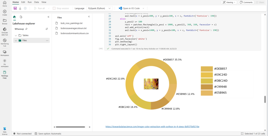
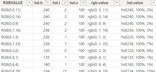
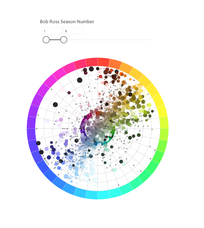
In this example I’ve collected the dominant colours of Bob Ross paintings using python in Microsft Fabric Notebooks, converted these colours to HSL values.
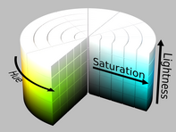
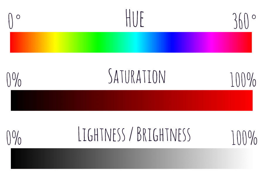
HSL = Hue, Saturation and Lightness. Where hue is an angular dimension with values between 0 and 360 and saturation and lightness are values between 0 and 100
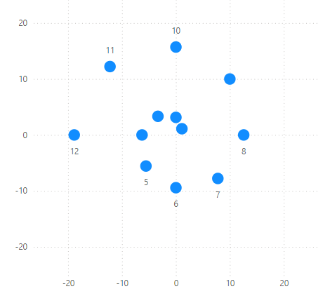
In Power BI, with the following data,
I can convert the hue values to X and Y coordinates with the following measures:
Angle (to convert degrees to radians)
Angle =
// degrees = 360/number of categories
// To convert from degrees to radians, multiply the number of degrees by π/180
MAX(dominanthslcolours[hsl.h])*(PI()/180)
X
X =
// x = rsinθ
var r = Max(dominanthslcolours[hsl.s]) // length to plot (saturation)
var theta = [Angle] // (hue in radians)
RETURN
r * SIN([Angle])
Y
Y =
// y = rcosθ
var r = Max(dominanthslcolours[hsl.s]) // length to plot (saturation)
var theta = [Angle] // (hue in radians)
RETURN
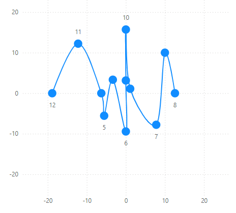
r * COS([Angle])These measures can then be dragged into a scatterplot and the point size set as percentage of colour dominance in each painting,
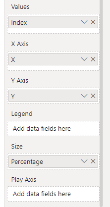
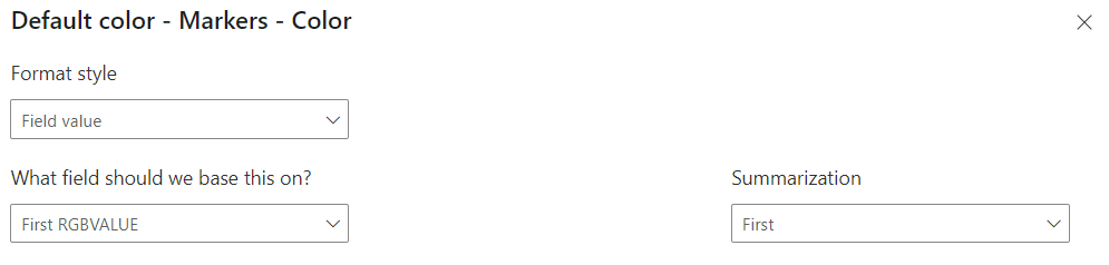
and the points to be conditionally formatted to RGB Values
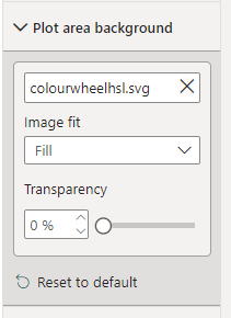
The X and Y axis can be set, gridlines turned off, and a plot area background image of a colour wheel selected
To create a plot showing the dominance of colours along the hue and saturation dimensions. A third dimension will need to be used for lightness.
To learn more of the other visual analyses I conducted with this dataset, my presentation file can be downloaded here:

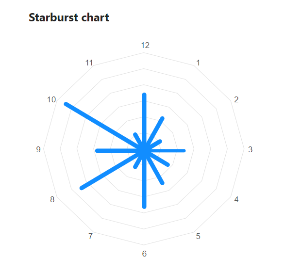
Radial Column
To create a radial column chart is a little more complex, and that will be featured in an upcoming blog.