
Power BI development is a relatively straight forward process when managed by one individual start to finish. But when the development process is shared among team members, ways of working need to be established and common work management frameworks such as agile, lean, HCD and UI/UX Design are adopted.
These frameworks can be useful for teams but as always, the rigid adoption and adherence to frameworks can cause project inefficiencies. It took a fair bit of corporate learning to acknowledge that applying Agile methodologies to a construction project and waterfall methodologies to a software project, weren’t effective.
With BI Development the traditional approach BI Teams take is to follow the Kimball Application Lifecycle Development Process. This process is light on design guidance, as noted by J. F. LANDUTAMA AND A. CHOWANDA and many practitioners have attempted to overlay Lean, CI and various design thinking methodologies to aid in better dashboard usability outcomes. UI/UX is a derivitive of design thinking and is commonly applied to BI projects.
Design Frameworks Are Not Interchangeable
UI/UX design is a discipline built around software and application behaviour. Its tools — wireframes, user personas, user journey maps — are purpose-built for designing interactive products: apps, websites, digital services. They help teams model fictional but representative users, map the steps those users take through a product, and prototype interfaces before development begins.
Adopted wholesale into Power BI report development processes without due consideration – can cause team members some strain and produce some less than effective outcomes.
Wireframing, for instance, is the process of creating a low-fidelity, skeletal blueprint of a website or app, focusing on layout, content placement, and navigation rather than visual design.

Wireframing is useful when you are designing an application with navigation states, interactive flows, and user-triggered actions yet a Power BI report isn’t always used like an app. It already has a page navigation and filter pane experience. Its consumers are typically known — a finance team, a store manager, an executive — and the interaction model is shallow: filter, drill, read.
Wireframing makes less sense here than it does in product design.
When BI development is stuck in the mindset of application development, there is a risk of creating an app, within an app, within an app, within an app…
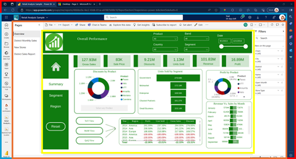
…creating an overwhelmingly inconsistent navigation experience for end users.
When going from a low fidelity to high fidelity wireframe, the developer spends a lot of time building an aesthetic that may or may not be able to be reproduced in Power BI, and if done before the shape, structure and quality of data are known, the developer potentially locks themselves in to the wrong visuals for the data, or worse… bar charts that are too wide, or too short resulting in disproportionate visuals and endless scrollbars.
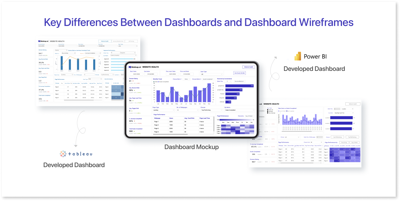

Wireframing can feel counterproductive for report developers that are focused on insights and data analytics. Patterns and insights cannot be surfaced without first exploring the data.
In practice, the most effective reports tend to emerge from a different process: starting with the business questions, interrogating the data using a variety of visuals to understand the shape and patterns in the data, then designing the right visual to explain or monitor the insights. Once those visuals are identified, they can be arranged deliberately on the page to tell a clear and coherent data story for the intended audience.
User personas, another UX tool, are fictional composites — useful precisely because you don’t know your users. In most internal reporting contexts, you do. You can speak to the actual stakeholder, understand their actual decisions, and design against real information needs rather than imagined ones. Using persona templates without consideration can result in wasted effort – do you really care if the end user of the business report is 40 years of age, married and very busy?
User journey maps track emotional and functional states across extended sequences of touchpoints. For a report someone opens, filters twice, and closes in ten minutes, this is a bit much.
This isn’t to say UX thinking is irrelevant to reporting — it has its uses. But the tools need to be modified to match the context.
Sidetrack : How can they be matched to context?
- Sketches and mockups — similar concept to wireframes, sketches gets layout and story intent across before you’ve touched any design tool, a good communication aid for stakeholders. Mock-ups in the BI tool itself from dummy data representative of the intended data can help stakeholders visualise the report and walk-through information needs.
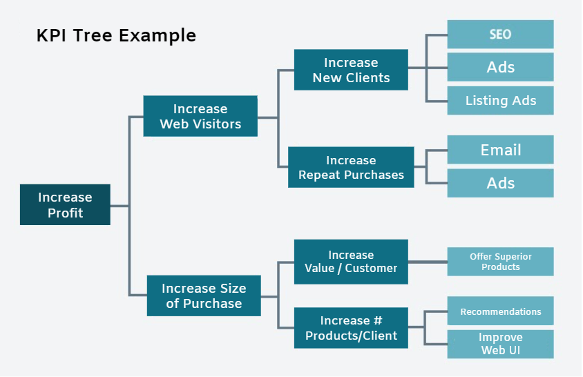
- KPI driver trees — alternative concept to user journeys, a metrics hierarchy, discerning which metrics drive others, linking strategy, objectives, metrics and actions, helping to structure and keep a report relevant, insightful, and actionable.
- Decision trees — structure the questions the report needs to answer, in what order, for whom. Useful if the measures and metrics aren’t known from the outset.
When Aesthetics Works Against You
Aesthetic conventions that work beautifully in UI design can actively undermine communication in data visualisation.
Rounded corners on buttons reduce visual tension. Gradients on cards add depth and hierarchy. Smooth transitions between states reduce cognitive load during navigation. These are legitimate, well-evidenced design choices — for interfaces.
The problem is that in a chart, every visual property is doing analytical work. A gradient fill on a bar implies luminance variation within the bar — the eye reads that as a magnitude gradient, not a stylistic choice. A rounded cap on a bar introduces ambiguity at the value boundary: the flat top of a bar is a precise visual anchor; a rounded cap is not.
And then there’s smoothed lines…
Data Encoding and the Grammar of Graphics
Before understanding why smooth lines are often misapplied, it helps to first talk to the basics of chart design.
A chart is not a picture of data. It is a systematic mapping of data values onto visual properties. Following convention of The Grammar of Graphics, charts are compositions of layers, each of which maps a variable to a visual channel — position, length, area, colour hue, colour saturation, shape, angle, or texture.
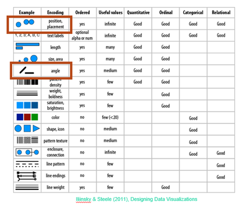
Each visual channel has different perceptual properties. Position along a common scale is the most accurately read. Length is close behind. Area and angle are read less precisely. Colour hue encodes categorical distinctions well but ordinal magnitude poorly.
When building charts it helps to remember our data types, as these are important to choosing the most effective encodings. The right encoding for a continuous quantitative variable is different from the right encoding for a nominal category.
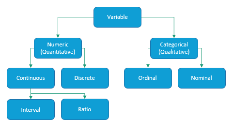
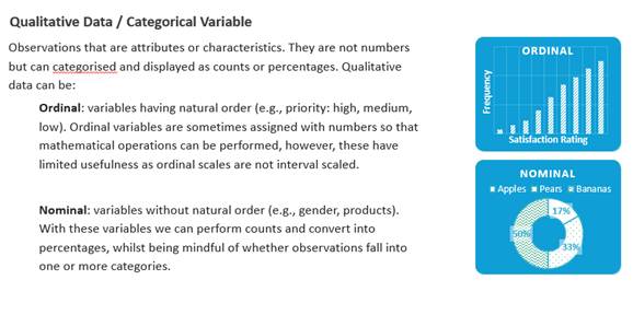
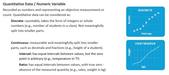
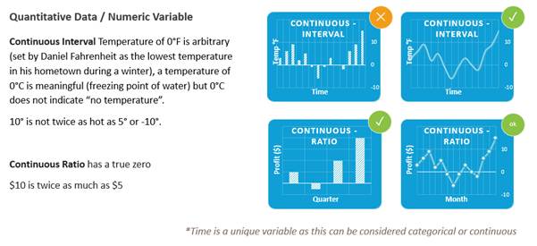
When you build a bar chart, you are mapping a quantitative variable to length along a positional axis. When you add colour to encode a second variable, you are adding a second channel. Every design decision — whether to use a bar, a line, a dot; whether to use colour or shape — is a claim about how the data should be read.
This matters because it means a smoothed line is not a neutral aesthetic. It is a specific encoding choice that carries a specific claim.
What a Smooth Line Is Claiming
With data we are often sampling points in time, or points in a population — we have discrete observed values.
We may connect discrete points by lines for three reasons:
1) to more visibly show order (e.g. movement through time),
2) to show relatedness, (e.g. all points within a series)
3) to double-encode (e.g. slope/angle represents the degree of change between one point in time and another.
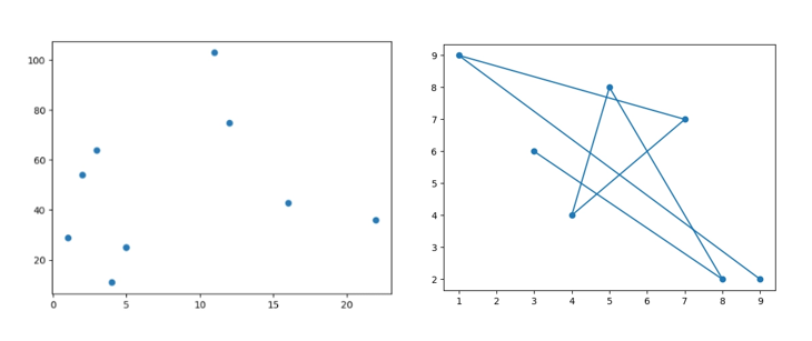
If we have a lot of data points, we might in effect turn the markers off.

The kinks in a connected line signal where the data points are. The straight segment connects them. The line does not claim to know what happened between the points.
A smooth or curved line makes a different claim. A smooth line results from either a ridiculous amount of data points, or from a mathematical model of the relationship between variables.
If we hive highly variable, volatile or noisy data, we may be tempted to smooth out this noise, by applying data smoothing techniques like a rolling average or LOESS regression (see also timeseries smoothing post)
Conventionally, a rolling average or LOESS regression trend line representing smoothed data will be charted as a smoothed line.
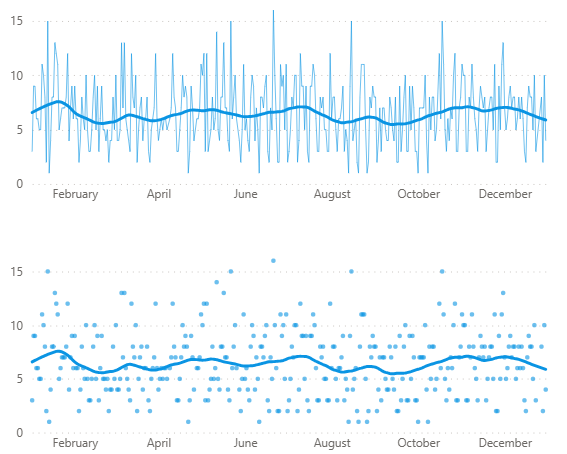
If data is part of a natural, continuous physical process (physical growth, wave cycles, temperature change over time), applying a curve-fitted line makes sense. We can reasonably assume that between observed points, variable y has predictably changed with variable x. We will see an increase in height at age 12.35 years that we can assume is somewhat proportionally accurate.
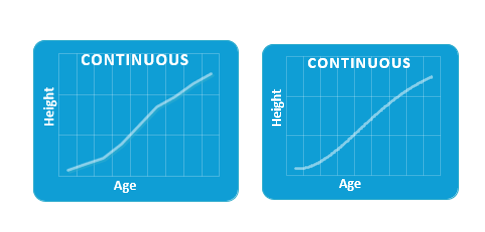
Most data used in business reporting is not truly continuous. Monthly profit figures, for example. This by and by where line smoothing is conceptually misapplied.
Whilst you might expect the height of a plant to gradually increase between 1 January and 1 February, profit may not have gradually increased between those same dates — at certain intervals it may have decreased.
Business reporting periods are non-continuous. A curve between monthly figures implies continuity that doesn’t exist in the data, or in the real-world process generating it.
A curve is a physically continuous or data smoothing claim. A model of the underlying data.
Interpolation, Smoothing, and Curve Fitting — Not the Same Thing
These three concepts often get conflated.
Interpolation constructs estimated values between known data points. There are a number of different interpolation methods.
(View some of the interpolation methods in the interactive chart below)
A spline interpolation fits smooth curves between consecutive observations, passing exactly through each one.
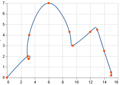
Monotone cubic interpolation (aka “smooth” in Power BI) adds the constraint that the curve can’t change direction in ways not supported by the surrounding points. It won’t overshoot your values.
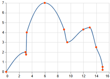
Smoothing — rolling averages, LOESS, smoothing splines — don’t pass through every observed point. This is appropriate when you have many noisy observations and want to surface the signal. It is not a representation of individual data point values.
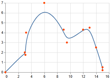
Curve fitting is the broader process of finding a mathematical function that best describes the relationship between variables. Curve fitting can involve either interpolation where an exact fit to the data is required, or smoothing, in which a “smooth” function is constructed that approximately fits the data.” Regression such as polynomial or quadratic regression are examples of curve-fitting.
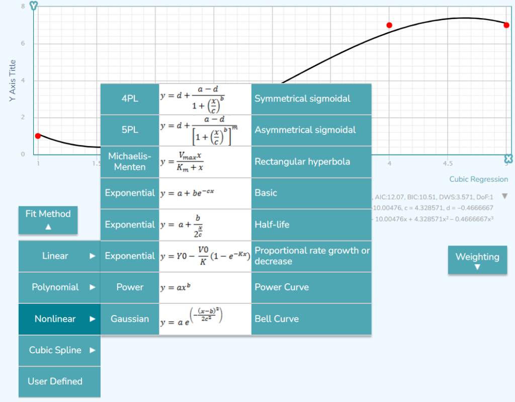
In effect :
- A straight line connecting points says: here are your observations, in order.
- Interpolation says: here is my estimate of the path between your observations.
- Smoothing says: here is the underlying trend, stripped of noise.
The Specific Disadvantages of Smooth Lines in Business Charts
The below charts depict the same data points. Three different interpolation methods (linear, monotone and cardinal) were used to draw the line connecting the data points.
Each chart is read differently.
Same data different path shapes with different interpolation methods (linear, monotone and cardinal)
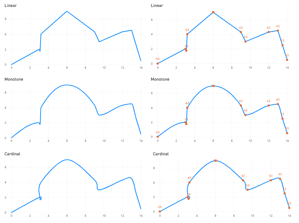
By looking at the charts above, we can see a smooth curve can misrepresent direction.
Because interpolation constructs estimated values between data points, the curve can suggest a path your measurements never captured – which viewers read it as a representation of reality.
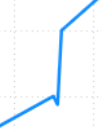

A line that curves upward between two flat or declining values can imply growth (e.g. growth in revenue) that didn’t happen.
Monotone is a favourite as it avoids overshoot but it introduces its own distortions. Because it prevents the curve from moving in a direction not supported by adjacent points, it can create the visual impression of a dip or stall between observations where the actual change was perfectly linear or consistently increasing. The constraint that prevents one kind of perception error introduces another.
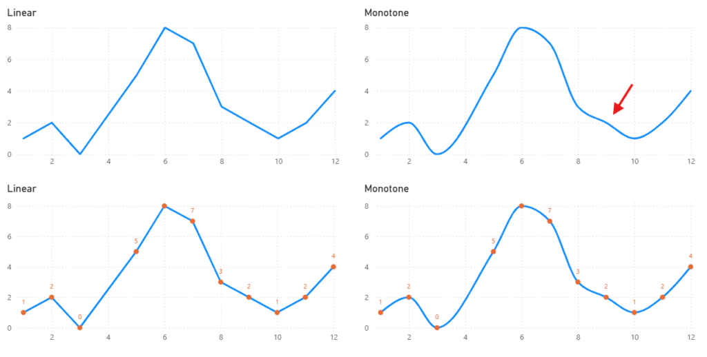
Also noticeable from the illustrated examples, is that shape of the line affects where we perceive (or don’t perceive) the data points to be. Discrete values become invisible without markers. When a smoothed line is rendered without point markers, readers lose access to where actual observations sit. Straight-line segments make this easier (although not foolproof) as the kink at each join signals the data point. A smooth curve obscures it.
Where are the data points?
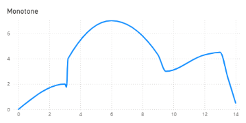
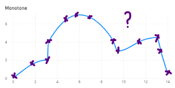
ahhh… dang it, I was wrong…
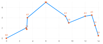
Curves imply gradual, measured change — a narrative of smooth progress or smooth decline. For business metrics that can reverse sharply within a reporting period, this can mislead.
The Principle
A smoothed line is a model claim. It asserts something about the behaviour of a variable between its observed values. Model claims should be explicit, justified, and labelled.
If you are showing trend across many data points and want to surface the underlying signal, use a smoothing method and label it clearly. If you are showing discrete observed values in a business reporting context, connect them with straight lines.
A smooth line applied because it is aesthetically pleasing is a valid design choice if applied with deliberate and informed intent. If chart creator acknowledges that the underlying data is approximate, that gist is better than accuracy, and it doesn’t matter whether individual data points are accurately read – a smooth line can work well.
Every visual property in a chart is encoding something. Make sure it’s encoding what you intend.
Happy Vizin’ 🎵
ᕕ(⌐■_■)ᕗ
Hadn’t seen “Kimball Application Lifecycle Development Process” all spelled out for a while. Good to see it! You might like to see:
* http://www.kimballgroup.com/2009/08/04/design-tip-115-kimball-lifecycle-in-a-nutshell/
* https://www.kimballgroup.com/data-warehouse-business-intelligence-resources/kimball-techniques/dw-bi-lifecycle-method/
Kerry, I love this post. It’s a great breakdown, thanks!
Thank you Nicky