
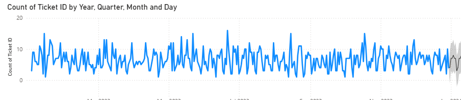
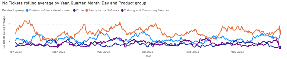
Quite often when exploring data within Power BI, we might want to visualise timeseries data, only to be met with an unsightly jagged line:
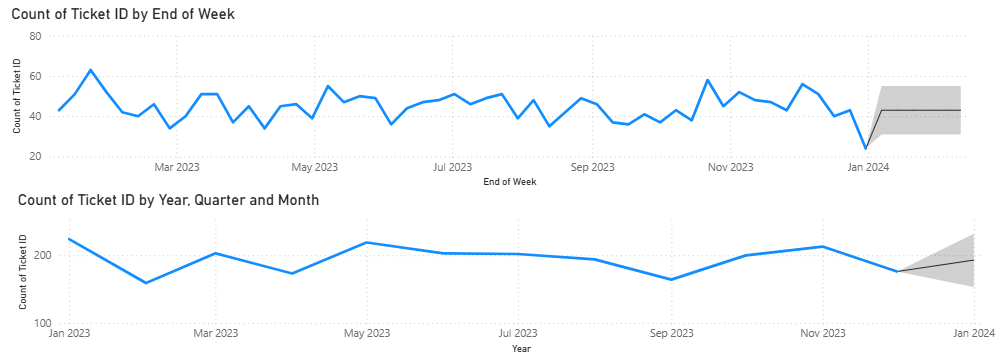
We might be tempted to smooth it by changing to weekly or monthly counts
Or even a a rolling average
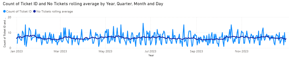
DAX pattern for rolling average generated using quick measures:
No Tickets rolling average =
IF(
	ISFILTERED('Service Desk'[Created datetime]),
	ERROR("Time intelligence quick measures can only be grouped or filtered by the Power BI-provided date hierarchy or primary date column."),
	VAR __LAST_DATE = LASTDATE('Service Desk'[Created datetime].[Date])
	RETURN
		AVERAGEX(
			DATESBETWEEN(
				'Service Desk'[Created datetime].[Date],
				DATEADD(__LAST_DATE, -7, DAY),
				DATEADD(__LAST_DATE, 7, DAY)
			),
			CALCULATE([No Tickets])
		)
)
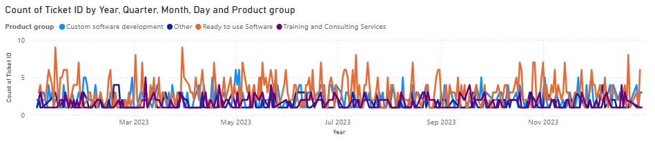
But. What we really want to see is daily numbers and the resultant trend or pattern. And this gets messy if we want to compare two or more series.
(Rolling average lines are better but don’t show us the underlying data and variability and what outliers might be driving up those averages).
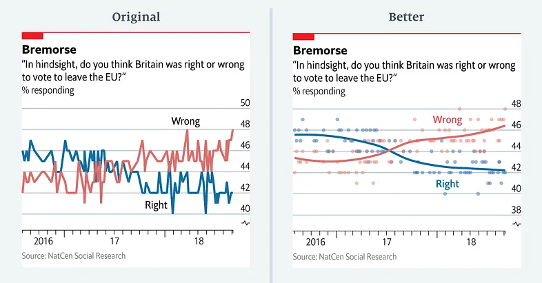
We can approach this by producing a scatter of individual data points and performing a regression to produce a line of best fit.
Sarah Leo demonstrates the difference in her article, and shows why The Economist and other data journalism sources now choose this method. “Looking at the data, it appears as if respondents had a rather erratic view of the referendum result — increasing and decreasing by a couple of percentage points from one week to the next.”. A smoothed line can guide a user through the variability to more easily see trend.
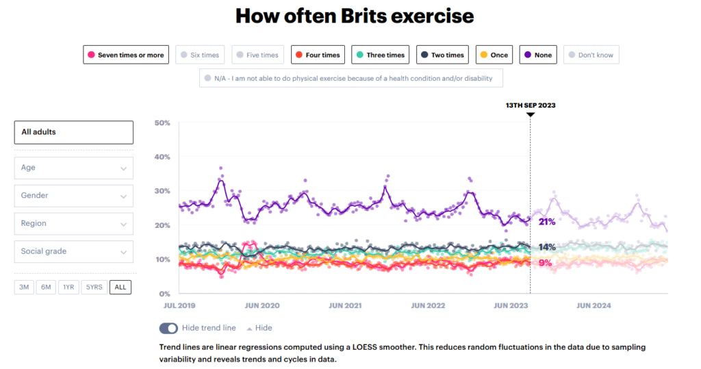
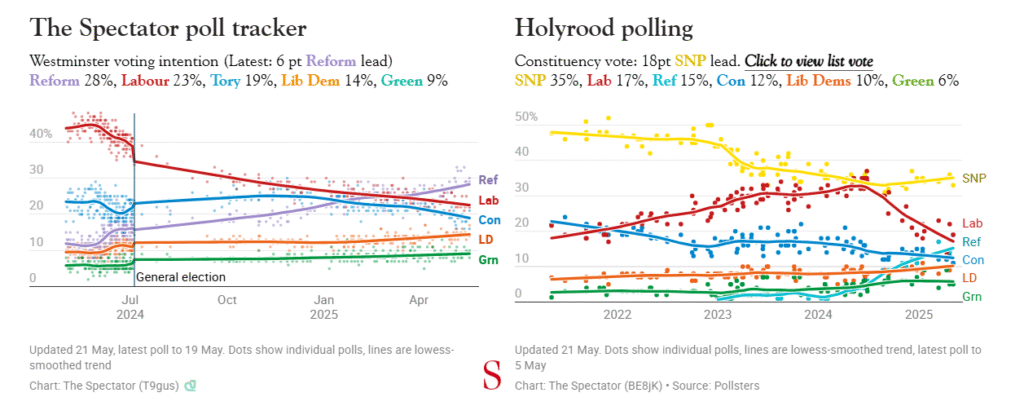
Of course, we can place a running average over scatter points, and that is perfectly fine, but with regression, we can have finer control of the smoothness of the lines how much impact outliers have on overall trend.
The Royal Netherlands Meteorological Institute, in a 2020 report recommends LOESS of the traditional method over 30-year moving averages to produce a trendline. The LOESS recommended in this case is a generalisation of the moving average.
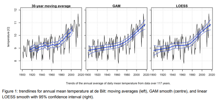
There are various types of regression methods to consider, but this article will be focusing on LOESS or LOWESS, as it is one of the more sophisticated methods, but also readily available in Vega-lite thus, easy usage for Power BI Developers.
As defined by this source, LOESS (locally-estimated scatterplot smoothing), is a nonparametric regression technique that fits a smooth curve through a scatterplot of data. It does this by performing local, weighted regressions over sliding windows of data points.
To create LOESS in Power BI, we need to utilise our trusty Deneb custom visual.
Once we have imported the visuals and brought in the necessary fields into our data visualisation, we can begin by plotting our scatter points:
{
  "data": {
    "name": "dataset"
  },
  "layer": [
    {
      "mark": {
        "type": "point",
        "filled": true,
            "color": {
              "expr": "pbiColor(0)"
            },
            "opacity": 0.6,
            "size": 20
      },
      "encoding": {
        "x": {
          "field": "Date",
          "type": "temporal"
        },
        "y": {
          "field": "No Tickets",
          "type": "quantitative"
        }
      }
    }
]
}
Then we can add a second layer which introduces a LOESS transform on the Y-Values:
{
      "mark": {
        "type": "line",
            "color": {
              "expr": "pbiColor(0)"
            }
      },
      "transform": [
        {
          "loess": "No Tickets",
          "on": "Date",
        "bandwidth": 0.1
        }
      ],
      "encoding": {
        "x": {
          "field": "Date",
          "type": "temporal"
        },
        "y": {
          "field": "No Tickets",
          "type": "quantitative"
        }
      }
    }
The bandwidth controls the resolution of the local regression estimate – adjusting this value adjusts the smoothness of the line.

Full code:
{
  "data": {
    "name": "dataset"
  },
  "layer": [
    {
      "mark": {
        "type": "point",
        "filled": true,
            "color": {
              "expr": "pbiColor(0)"
            },
            "opacity": 0.6,
            "size": 20
      },
      "encoding": {
        "x": {
          "field": "Date",
          "type": "temporal"
        },
        "y": {
          "field": "No Tickets",
          "type": "quantitative"
        }
      }
    },
    {
      "mark": {
        "type": "line",
            "color": {
              "expr": "pbiColor(0)"
            }
      },
      "transform": [
        {
          "loess": "No Tickets",
          "on": "Date",
        "bandwidth": 0.1
        }
      ],
      "encoding": {
        "x": {
          "field": "Date",
          "type": "temporal"
        },
        "y": {
          "field": "No Tickets",
          "type": "quantitative"
        }
      }
    }
  ]
}
Check out this Workout Wednesday Challenge for a multi-series plot with solution file : https://workout-wednesday.com/2025-week-11-power-bi-scatterplot-timeseries-smoothing/

Happy Vizin’
ᕕ(⌐■_■)ᕗ ♪♬
Kez
I love it. Thanks. However, could you please also show how to obtain confidence interval on for the smoothed curve?
That’s really cool but I’ve just found out that in Vega-Lite the LOESS bandwidth property must be set to a constant value and cannot be set dynamically based on external slicer value. That’s kind of spoils it for me. Perhaps Vega would be more flexible.