
As far as custom visualisations go for Power BI, the HTML Content visual is one of the most versatile. Demonstrated uses of the visual have been:
- HTML tables
- displaying SVGs
- rich text formatting
- Google Fonts & Web Fonts,
- embedding images, tweets, audio, websites, gifs and videos.
WSS Schools provides a good overview of HTML, and what might be possible to do within Power BI, if the tool and visual were without constraint.
The HTML Content visual documentation site gives excellent walkthroughs and an informative explanation of the constraints of the visual and why some websites/videos will display when embedded, and others won’t.
Aside from a blog I drafted years ago (which I decided to hit publish on today), few (if any?) have written about embedding other data visualisations within a Power BI report. So I’ll write a little to bridge the gap on how, and why.
Why?
When incorporating data visualisations into a website or blog, there are many tools to choose from. Popular options among data journalists include Datawrapper, Flourish, and D3.js. Other common tools, used by organizations’ such as the Australian Bureau of Statistics, are Highcharts, AM Charts, Vega and the javascript libraries, plotly.js, chart.js and Google Charts.
Tools like Datawrapper offer features to ensure data transparency by including sections for data sources and citations, making it ideal for journalists, researchers, and anyone needing to visually present data with credibility. Organizations’ that are invested in providing access to open data, may use some of these tools to provide charts that can be reshared and embedded, proving useful as the data source link, credit and citation follows. Embeddable charts from trusted sources are a convenience that saves resources and keeps the visualisation updated as data changes without having to recreate the wheel.
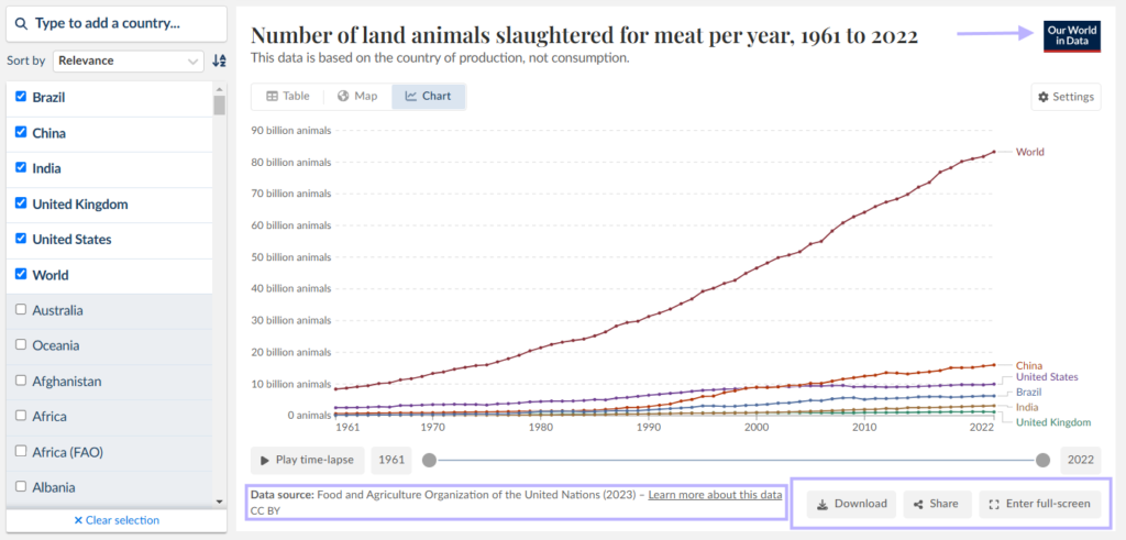
(Example embedded data visual — click for interaction)
Whilst I can’t imagine embedding charts from web sources as being a common use case for Power BI Developers beyond the occasional school assignment, it’s something for consideration.
Google Charts
Google Charts is a free, cloud-based visualisation library that allows developers to create interactive charts using JavaScript and HTML. With a simple Javascript embedded in a webpage, using the Google Charts API via a script tag, Google Chart libraries can be loaded and external data referenced or declared inline structured as an array. There are a number of chart types available with extensive customisability. Data is fetched dynamically and charts rendered directly in the browser using HTML5/SVG.
(Example embedded Google Charts data visual — click for interaction)
How?
Sites that use Datawrapper or other such tools, may or may not allow a user to embed a visual using an iFrame. Look for this option on the graphs.


- Copy the embed code and in a text editor such as notepad replace all ” with ‘
- Paste this code as string into a DAX measure
- Import the HTML Content visual from AppSource and place on the Canvas
- Drop the measure into the HTML Content Field Well…
… and Voila

For Google Charts,
An iFrame is not needed. The HTML specification can be drawn and customised within a DAX measure
Measure 4 = "<html>
<head>
  <script type='text/javascript' src='https://www.gstatic.com/charts/loader.js'></script>
  <script type='text/javascript'>
    google.charts.load('current', {'packages':['gantt']});
    google.charts.setOnLoadCallback(drawChart);

    function drawChart() {

      var data = new google.visualization.DataTable();
      data.addColumn('string', 'Task ID');
      data.addColumn('string', 'Task Name');
      data.addColumn('string', 'Resource');
      data.addColumn('date', 'Start Date');
      data.addColumn('date', 'End Date');
      data.addColumn('number', 'Duration');
      data.addColumn('number', 'Percent Complete');
      data.addColumn('string', 'Dependencies');

      data.addRows([
        ['2014Spring', 'Spring 2014', 'spring',
         new Date(2014, 2, 22), new Date(2014, 5, 20), null, 100, null],
        ['2014Summer', 'Summer 2014', 'summer',
         new Date(2014, 5, 21), new Date(2014, 8, 20), null, 100, null],
        ['2014Autumn', 'Autumn 2014', 'autumn',
         new Date(2014, 8, 21), new Date(2014, 11, 20), null, 100, null],
        ['2014Winter', 'Winter 2014', 'winter',
         new Date(2014, 11, 21), new Date(2015, 2, 21), null, 100, null],
        ['2015Spring', 'Spring 2015', 'spring',
         new Date(2015, 2, 22), new Date(2015, 5, 20), null, 50, null],
        ['2015Summer', 'Summer 2015', 'summer',
         new Date(2015, 5, 21), new Date(2015, 8, 20), null, 0, null],
        ['2015Autumn', 'Autumn 2015', 'autumn',
         new Date(2015, 8, 21), new Date(2015, 11, 20), null, 0, null],
        ['2015Winter', 'Winter 2015', 'winter',
         new Date(2015, 11, 21), new Date(2016, 2, 21), null, 0, null],
        ['Football', 'Football Season', 'sports',
         new Date(2014, 8, 4), new Date(2015, 1, 1), null, 100, null],
        ['Baseball', 'Baseball Season', 'sports',
         new Date(2015, 2, 31), new Date(2015, 9, 20), null, 14, null],
        ['Basketball', 'Basketball Season', 'sports',
         new Date(2014, 9, 28), new Date(2015, 5, 20), null, 86, null],
        ['Hockey', 'Hockey Season', 'sports',
         new Date(2014, 9, 8), new Date(2015, 5, 21), null, 89, null]
      ]);

      var options = {
        height: 400,
        gantt: {
          trackHeight: 30
        }
      };

      var chart = new google.visualization.Gantt(document.getElementById('chart_div'));

      chart.draw(data, options);
    }
  </script>
</head>
<body>
  <div id='chart_div'></div>
</body>
</html>"
For Vega-lite charts
An iFrame is also not needed. The HTML specification can be drawn and customised within a DAX measure (though I would recommend using Deneb)
Measure 7 = "<!doctype html>
<html>
  <head>
    <title>Embedding Vega-Lite</title>
    <script src='https://cdn.jsdelivr.net/npm/vega@5.30.0'></script>
    <script src='https://cdn.jsdelivr.net/npm/vega-lite@5.21.0'></script>
    <script src='https://cdn.jsdelivr.net/npm/vega-embed@6.26.0'></script>
  </head>
  <body>
    <div id='vis'></div>

    <script type='text/javascript'>
      var yourVlSpec = {
        $schema: 'https://vega.github.io/schema/vega-lite/v5.json',
        description: 'A simple bar chart with embedded data.',
        data: {
          values: [
            {a: 'A', b: 28},
            {a: 'B', b: 55},
            {a: 'C', b: 43},
            {a: 'D', b: 91},
            {a: 'E', b: 81},
            {a: 'F', b: 53},
            {a: 'G', b: 19},
            {a: 'H', b: 87},
            {a: 'I', b: 52}
          ]
        },
        mark: {'type':'bar', 'tooltip':true},
        encoding: {
          x: {field: 'a', type: 'ordinal'},
          y: {field: 'b', type: 'quantitative'}
        }
      };
      vegaEmbed('#vis', yourVlSpec);
    </script>
  </body>
</html>"
Both these measures will produce a visual within HTML Content, but may require a page refresh to redraw.
See also : Handlebars Visual
Considerations
Fundamentally not a feature of Power BI, and cannot be relied upon to work in future
Happy vizin’
               \|/ ____ \|/
                @~/ ,. \~@
               /_( \__/ )_\
                  \__U_/
Kez