
Power BI’s data bars in matrix visuals can be a helpful way to visualize numeric values quickly. However, they have limited formatting options that can impact how easily users interpret the data—especially when comparing values across multiple columns.
Built-in Data Bars
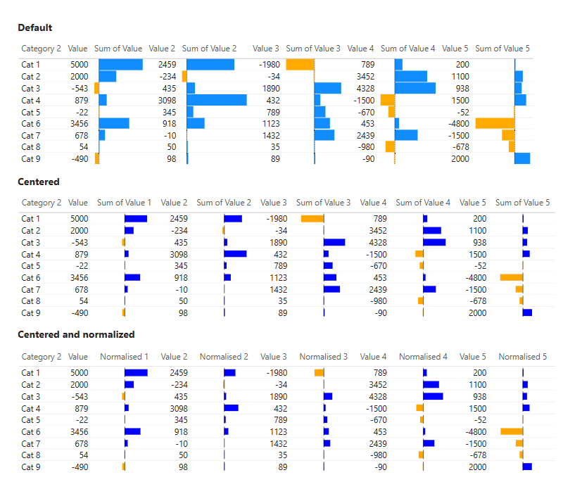
One of the limiting factors with the standard data bars in Power BI is that you cannot center the X-axis at zero. This might not seem like a big deal at first, but it causes a few noticeable problems:
- When your data contains both positive and negative values, the bars start from different positions, making them:
- hard to compare
- visually uncomfortable
- The visual proportion of bars across columns becomes inconsistent.
- The width of each column in the Power BI table or matrix can vary (usually due to column header length), which makes cross-column comparisons less accurate and more visually confusing.
It may seem a moot point if values are not intended to be compared across columns, however, these differences can inadvertently lead to erroneous perceptions of magnitude – specifically if all values are the same, not differing data types (e.g. currency, counts). Given the proximity and visual grouping of multiple data bars, we may be cognitively biased to presume these similar looking visuals would be on the same scale, and if coloured similarly, the same data type.
Using SVG to Create Custom Data Bars
To overcome these limitations, you can use SVG (Scalable Vector Graphics) to create your own data bars within a matrix. SVG gives you much more control over how the bars are drawn and displayed, including the position of the zero axis and sizing of the data bars.
To get started with SVG data bars, you’ll need to write a DAX measure that returns an SVG string. This string will draw the bar for each row or cell in your matrix.
1. Create a New Measure
Create a new measure using DAX. Here’s a simple example from my Templates Gallery with a centered zero axis:
Data Bars (positive_negative_centred) =
// Developed by Kerry Kolosko
VAR BAR_VALUE = SUM('Table'[Column 1])
VAR ABS_MAX = MAXX(ALL('Table'), ABS('Table'[Column 1]))  -- Highest absolute value
VAR X_ZERO = 50  -- Center of SVG
VAR X_SCALE = DIVIDE(50, ABS_MAX, 0)  -- Scale to 50 units from center

VAR BAR_START = IF(BAR_VALUE >= 0, X_ZERO, X_ZERO + BAR_VALUE * X_SCALE)
VAR BAR_WIDTH = ABS(BAR_VALUE * X_SCALE)

VAR PositiveColour = "blue"
VAR NegativeColour = "orange"
VAR BarColour = IF(BAR_VALUE >= 0, PositiveColour, NegativeColour)

RETURN
IF(
    HASONEVALUE('Table'[Category]),
    "data:image/svg+xml;utf8," &
    "<svg width='100' height='20' viewBox='-2 -2 102 22' xmlns='http://www.w3.org/2000/svg'>
        <rect id='fill' x='" & BAR_START & "' y='3' width='" & BAR_WIDTH & "' height='15' fill='" & BarColour & "' />
        <rect id='x-zero' x='" & X_ZERO & "' y='0' width='1' height='20' fill='black'/>
    </svg>",
    BLANK()
)
This measure creates a centered axis where X = 0, which makes it easier to compare positive and negative values across columns. However, the bars are not normalized—each column scales based only on its own maximum value. For example, if one column has a maximum of 3000, the bar will stretch to the full width of the cell. But if another column also has a maximum of 3000, their bars might not appear the same size, depending on local scaling. This makes cross-column comparisons difficult.
To fix this, we need to normalize the values by adjusting our DAX measures to use a consistent minimum and maximum across all relevant columns. This ensures that bars are scaled the same way, making visual comparisons accurate across the entire matrix.
A simple adjustment to the DAX measure can be made like so:
VAR MinAllColumns =
    {
        MINX (ALL('Table'), 'Table'[Column 1] ),
        MINX (ALL('Table'), 'Table'[Column 2] ),
        MINX (ALL('Table'), 'Table'[Column 3] ),
        MINX (ALL('Table'), 'Table'[Column 4] ),
        MINX (ALL('Table'), 'Table'[Column 5] )
    }
VAR MinAll = MINX ( MinAllColumns, [Value] )
VAR MaxAllColumns =
    {
        MAXX (ALL('Table'), 'Table'[Column 1] ),
        MAXX (ALL('Table'), 'Table'[Column 2] ),
        MAXX (ALL('Table'), 'Table'[Column 3] ),
        MAXX (ALL('Table'), 'Table'[Column 4] ),
        MAXX (ALL('Table'), 'Table'[Column 5] )
    }
VAR MaxAll = MAXX ( MaxAllColumns, [Value] )
2. Add This Measure to Your Matrix Visual
- Put this measure into a column or value section of the matrix.
- From the ribbon, turn “Measure Tools” > “Data Category” from “Text” to “Image URL”
- The SVG will now render as an image in each cell.
3. Adjust Sizing
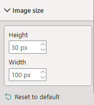
- Go to Grid > Image width in the matrix visual formatting settings and set it to a fixed width (e.g., 100 or 200) to make sure all SVG bars are uniform.
- All columns will now have consistent width and bars will align correctly (provided the column headers are not longer than the SVG).
4. Add Alt Text
If publishing to a broad audience, ensure dynamic Alt Text is set under the Accessibility settings
