
A relatively new Power BI Desktop release comes with the ability to rotate markers on scatter plots…
… some interesting use cases have arisen from this feature, but one such use case I’ve found useful is to create a spaghetti plot (aka strip plot) to show instances.
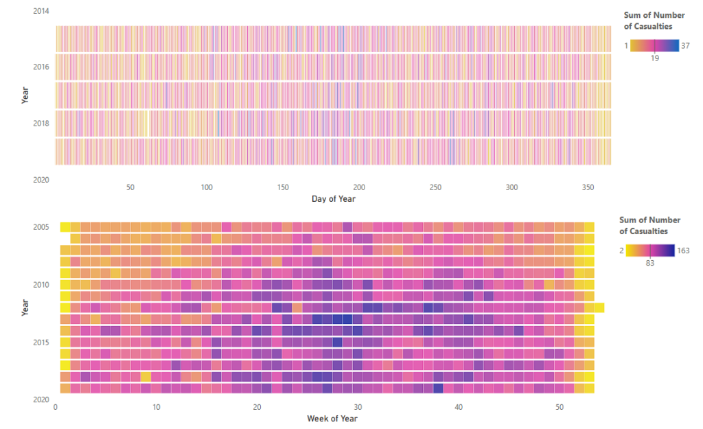
Here’s some easy steps to create this visual:
- Load your data, place the scatter plot on the canvas and place the relevant fields in fields well
- Remove gridlines
- Change the default marker type from ‘●’ to ‘—’
- Rotate the marker 90 degrees
- Adjust the size accordingly, using Size multiplier

6. Conditionally format the colour of the marker using an equalised colour scale. See Meagan Longoria’s blog.

7. Note: Power BI Scatter plot allows limited data points! If you require more datapoints use Deneb and override row limit or use Fabric Notebooks.
8. Template for a lasagna plot using vega-lite (for reuse in Deneb) can be found here
A heatmap can be achieved the same way using a rectangle marker.