How I created a slope graph with Power BI Core Visuals.
Many people have demonstrated how to create a slope graph with Power BI Core visuals, but I was curious how this would look with the most recent (September 2021) Power BI Updates.
Most Slope graphs I had seen in Power BI did not have vertical guide lines, which are needed in my belief, for readability ease. These Slope graphs were created on cartesian plots and options to create these guides easily and consistently were limited. With the new X-Axis constant line features, I was hopeful for a better visual.
To be able to use these constant lines, I needed to set the axis to continuous, which, made me squirm a little bit… but better to have guides than not…
To create the slope on a continuous axis, I needed to ensure the values between the min and max states weren’t plotted so I created a basic measure:
MinMax =

VAR mindate = CALCULATE(MIN('Abortion Support'[Poll Date]),ALLSELECTED('Abortion Support'[Poll Date]))
VAR maxdate = CALCULATE(MAX('Abortion Support'[Poll Date]),ALLSELECTED('Abortion Support'[Poll Date]))

Return

IF(MAX('Abortion Support'[Poll Date])=mindate || MAX('Abortion Support'[Poll Date])=maxdate, MAX('Abortion Support'[Value]),BLANK())
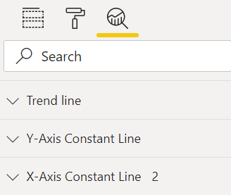
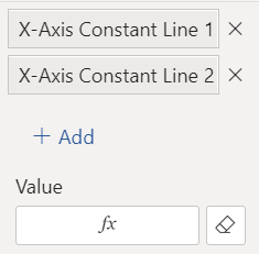
Added the constant lines
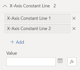
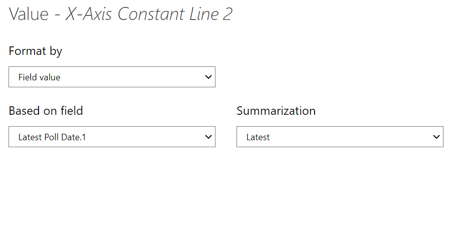
Selected the function button and formatted by last and first field values
Switching on the labels for constant lines is an option however, these do not format well. I kept these switched off and supplemented with other visuals.
I switched Data Labels on and formatted as desired.
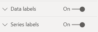
Similarly with Series Labels, I set right-aligned and switched on Word wrap.
Under the “Customise series” option I set the series label colours to the same colours as the lines and markers
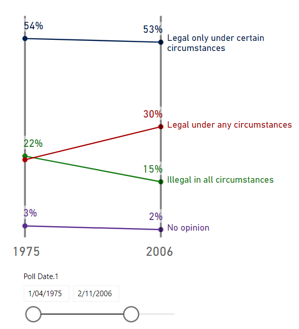
End result: