
What can cause more heart palpitations than a line chart that shows a sudden drop-off?
Well, quite a few things…
…but if you are like me and you’ve been given a report with a continuous line chart that shows a sudden drop in an important measure such as customer through-put, you might find yourself in a sudden panic. That is until you realise that the drop-off is due to an incomplete monthly reporting cycle.

So, for the sake of preventative health care, here’s one way to visualize the incomplete reporting period:

- Create a second measure that calculates up until the end of the last complete reporting cycle. In this example, the end of the prior month:
Count EOM =
CALCULATE(
  SUM('YourTable'[YourColumn]),
      'YourTable'[Date]<=EOMONTH(TODAY(), -1)
)

// or any alternative suitable to your model
2. Add the second measure to the visual. Format the new line as a solid line, and the other as a dashed line. If using data labels, enable these for only one of the lines.
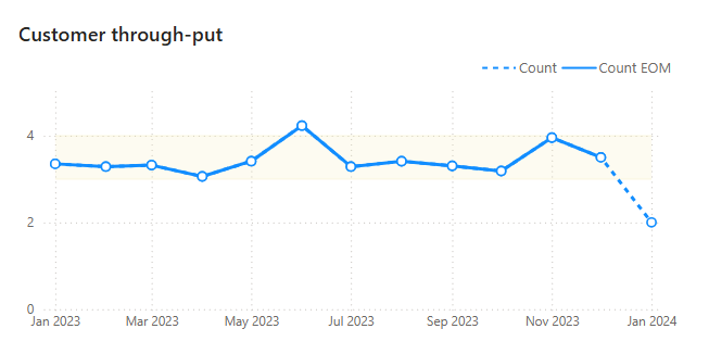
3. Adjust the Y-axis to start at zero (unless it makes sense not to)
If needing a trendline, ensure the trend line is added only for the measure with complete reporting periods, else the trendline becomes misleading. A trendline can be created using the LINEST() function

Considerations:
A dashed line is sometimes used to depict forecast values, so it is important to provide clear labelling to avoid misinterpretation.