
The New Card Visual is out in preview for the June 2023 Power BI Desktop – and it’s absolutely fantastic.
With this first drop of the Card Visual we can see flexible formatting options such as accent bars, images, backgrounds, padding, spacing and alignment. For a more comprehensive look check out this post.
There are a lot more features on the roadmap which you can find by tuning in to Miguel Myers.
Whilst microcharts have been hinted at, we can start to build them out now using SVG measures.
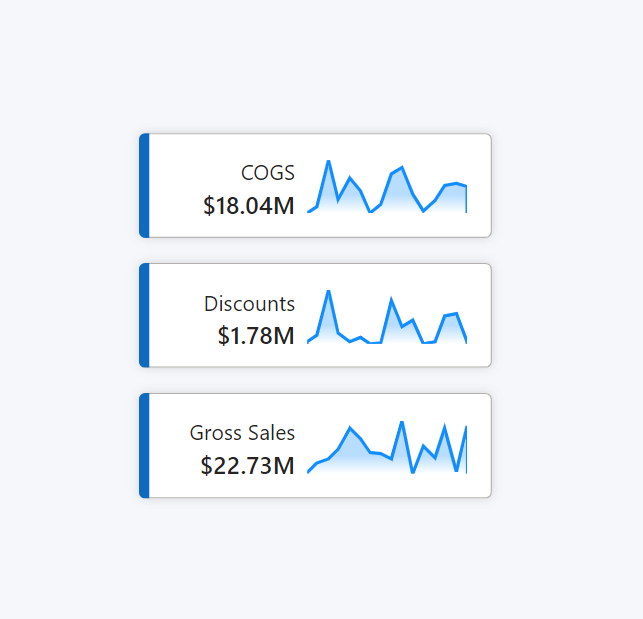
To do so, we first need to create a SVG measure with a SVG sparkline template, following a similar process to this post.
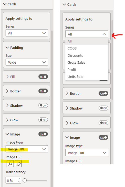
In the formatting pane, under “Cards”>”Image”, we can select “Image URL” from the “Image type” drop-down.
The FX option will show beneath, from which we can select the associated SVG measure. If using multiple cards, ensure the settings are applied to the relevant card.
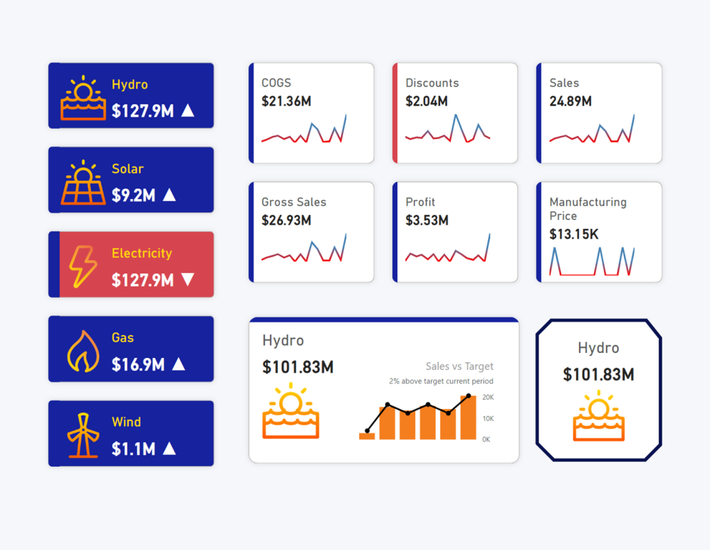
The preview is already so versatile in its formatting options, all kinds of styles can be created:
But perhaps one of the most important features about the New Card Visual, is that of performance. No longer shall we have slow report pages built of several layered KPI Visuals. Neither shall we resort to visual hacks to meet our needs, or custom visuals to meet very specific requirements.
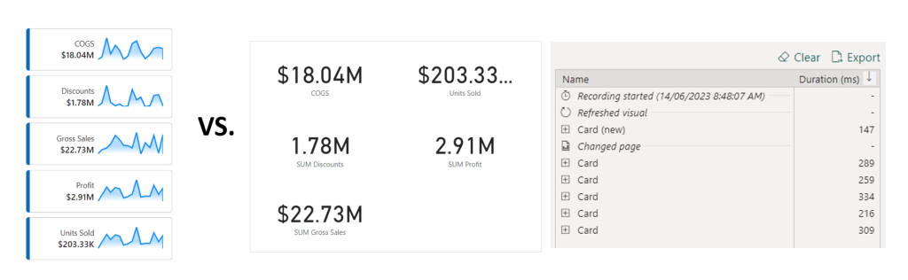
The formatting options in this new core visual are flexible enough to build out multiple KPI Cards in a single visual…
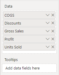
… and produce a clear performance enhancement
Joy!
☜(⌒▽⌒)☞
Kerry this is great stuff. Thank you for sharing. Do you have the PBIX files to share for the different style examples? I think that would be really helpful especially if something doesn’t work for someone to backwards engineer it. Cheers.
Kerry this is such a great breakdown of this new card feature. Great alternatives of how to use it and formatting options. Thanks a mill and keep it up!
Excelente! Thanks for sharing these highlights.
Sparkline Point did not work in New Card of Power BI.
the data:image comes out in other place and i see the dat:image line or picture. but not in image URL field of New Card. I am exhausted and i do not know how to do next.
Same issue here – I previously had used this approach for some reports and it worked great, but now it’s not working on the new card visual for me. If I add the SVG image url measure to a table it displays properly. I also noticed that if I open the old reports they no longer have the field value set in the conditional formatting, they just have the raw svg text for some reason.
This is a bug. Hopefully fixed in the nest Desktop release.
Hello All, i am using the refeared code and i cannot add it in the Umage URL selection and it returns the error “This field can’t be used here because a matching data type is required.” could you please advise?